Everything but the Dearest
A personal exploration of grief, memory, and connection
TIMELINE & TOOLS
Adobe InDesign, Illustrator, and Procreate, 4 weeks, 2024. Mixed media and print on acetate and paper.
Final senior assignment at OCAD University.
ABOUT
When my Type class presented us with the challenge of creating an original typographic storybook, I never imagined it would become my most meaningful project.
In January 2023, I lost my father unexpectedly, and suddenly this assignment transformed into something far more profound than a classroom exercise. Among our given prompts, 'Everything but the Dearest' struck a chord that resonated deeply with my experience of loss. What began as a technical challenge to combine typography, imagery, and flexible formatting evolved into a healing journey through design.
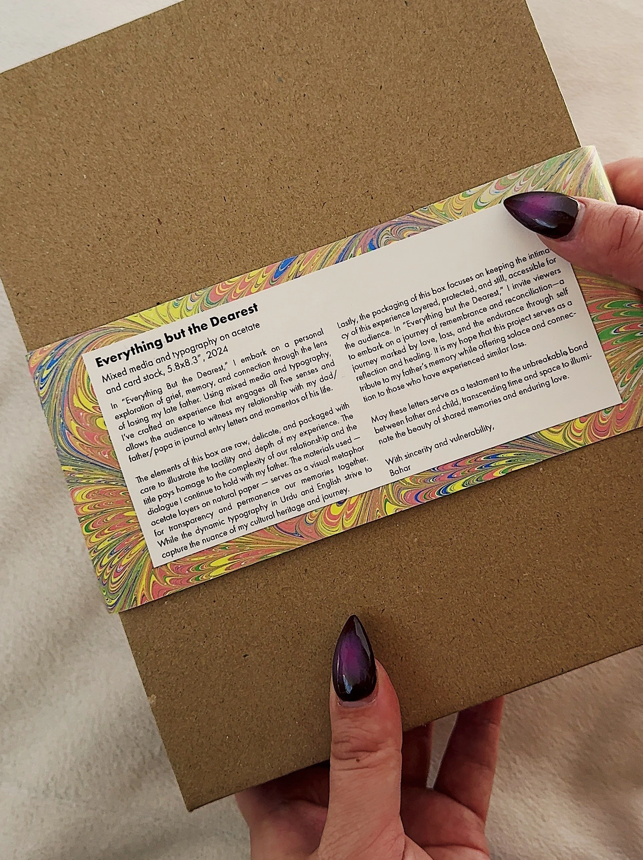
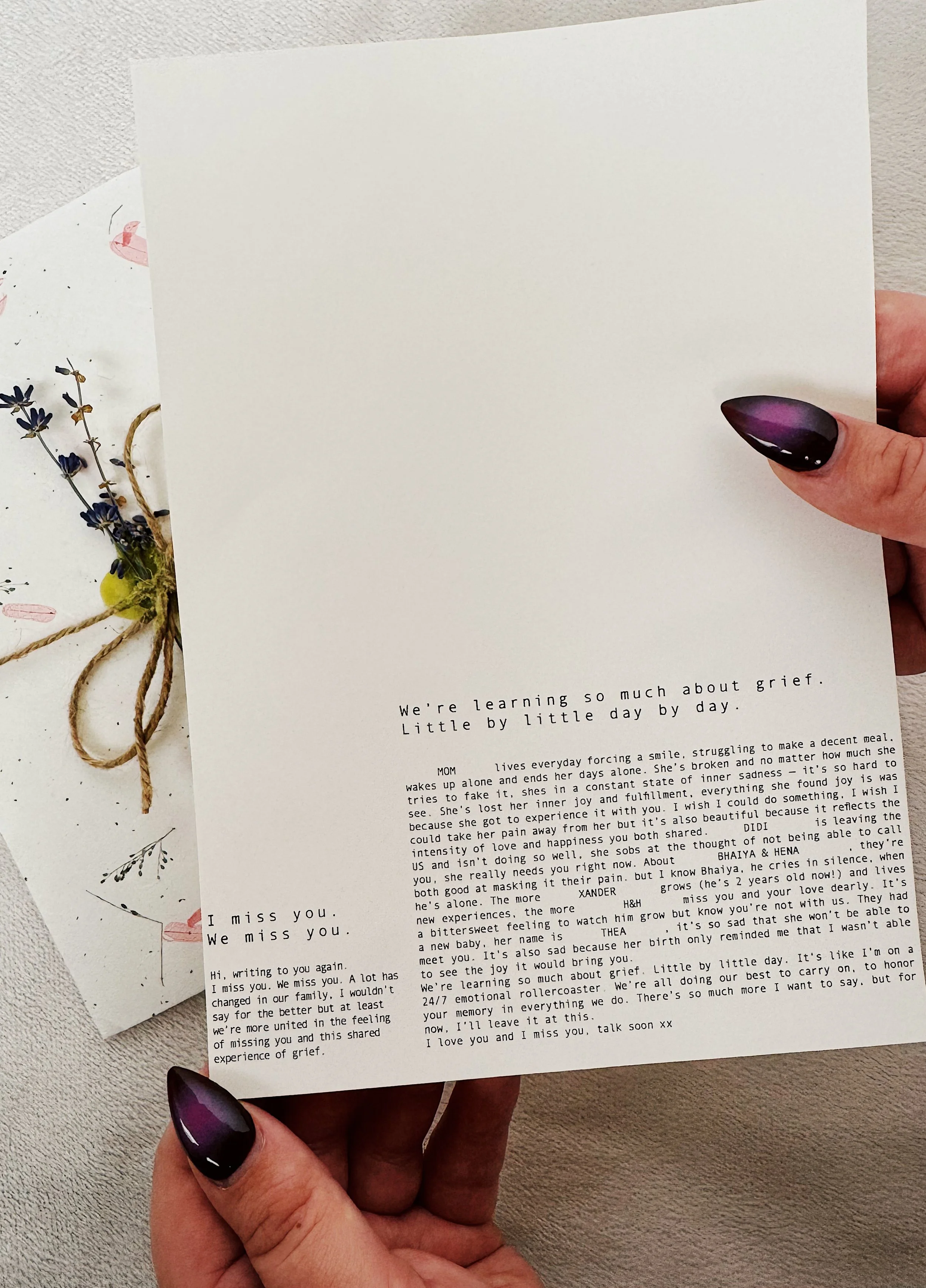
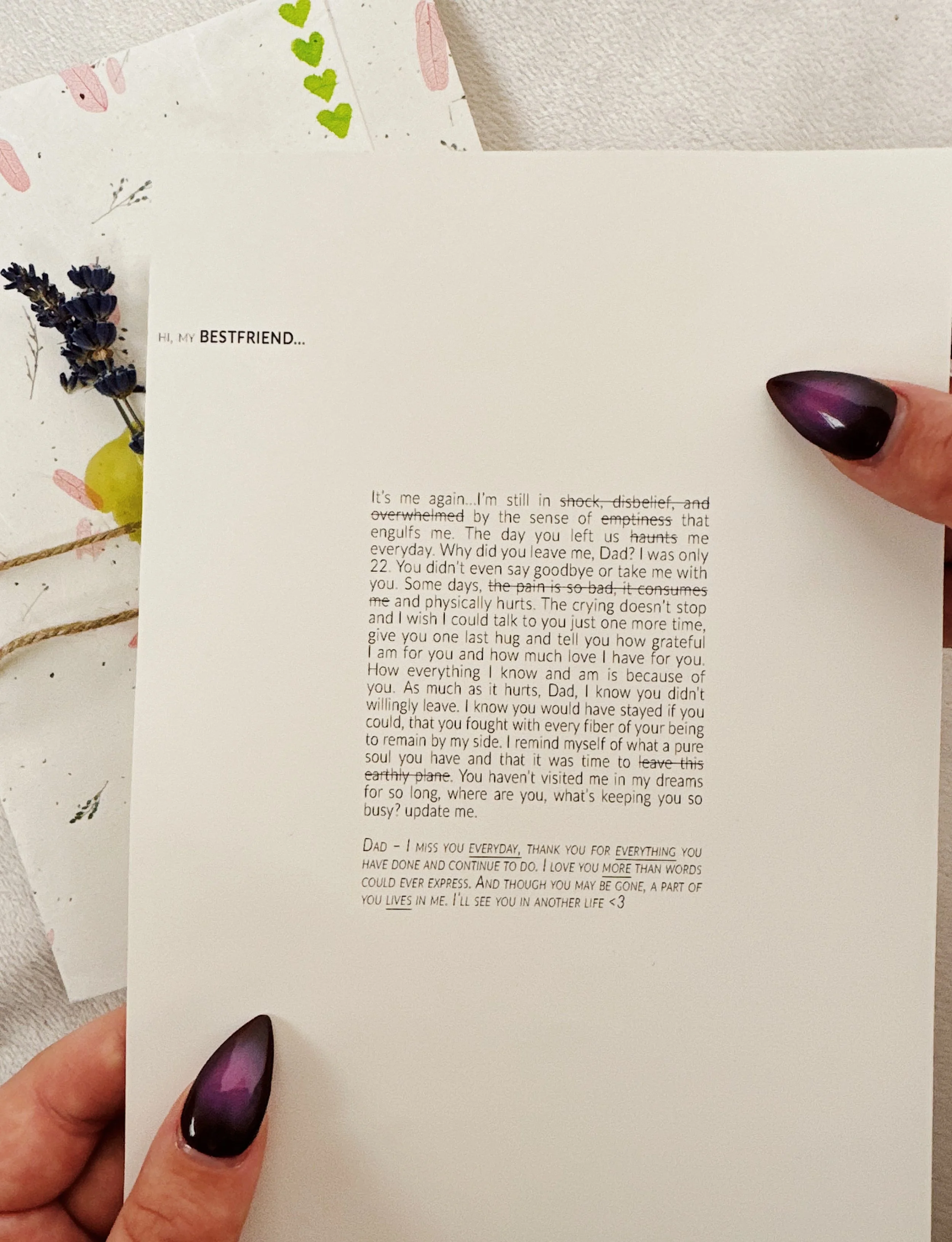
I poured my grief into crafting four letters to my father, housing them in a specially designed box that engages all five senses. Each design choice became intentional – not just for aesthetic value, but as a way to capture the raw, complex emotions of losing someone you love. Through careful integration of typography and tactile elements, I created something that speaks to both the heart and the eye, inviting viewers to experience the intricate layers of grief while celebrating my father's memory.


My Approach
Inspiration → Process → Packaging → Final Outcome
Inspiration
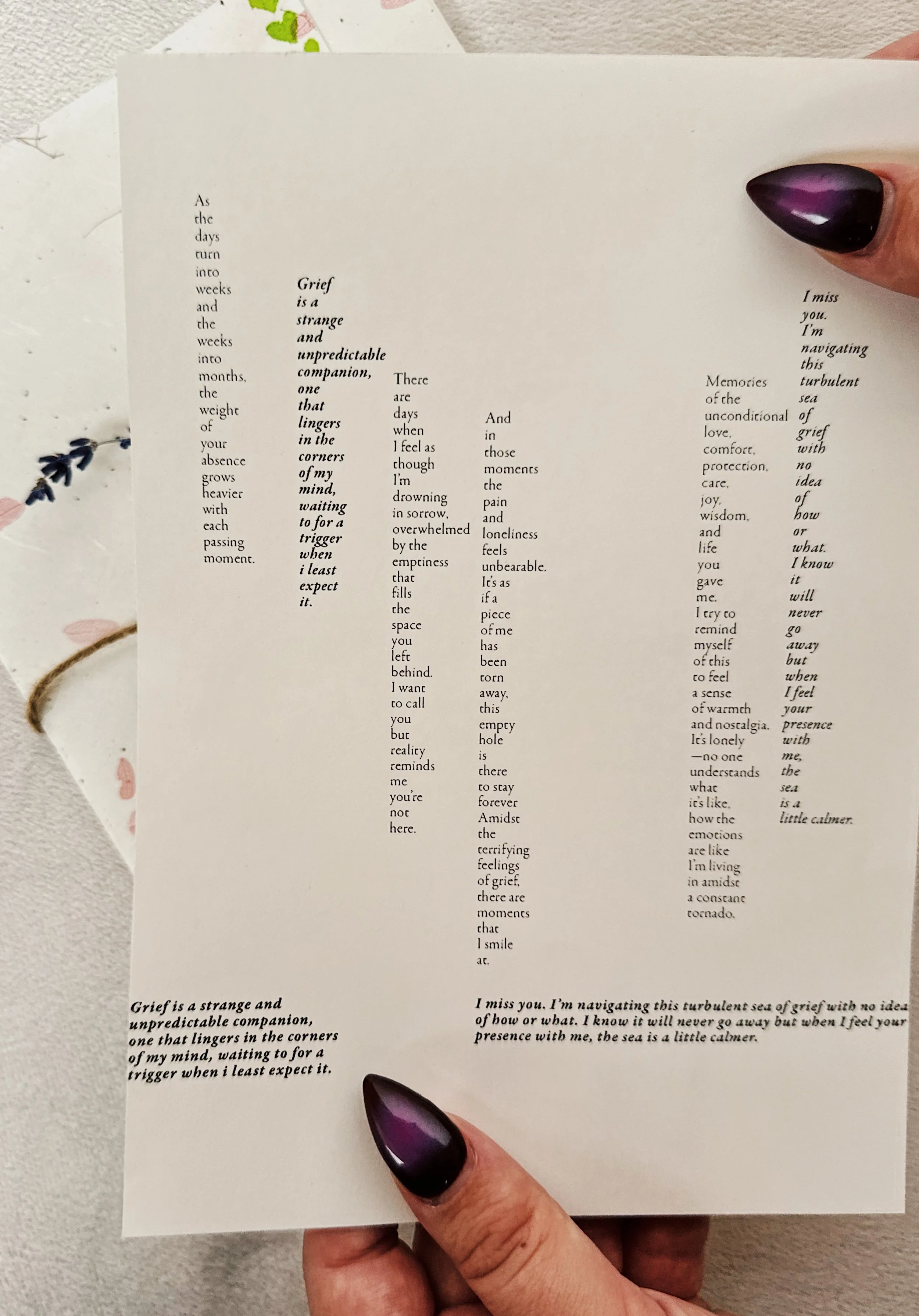
Tin altoid boxes, my South Asian culture: language and colors, gift packaging. Used language to showcase nuances of grief, used pattern and color to represent culture, and used typography to emphasize the intensity of loss.
I wanted the experience to evoke
Vulnerability · Warmth · Connection
Process
Iteration
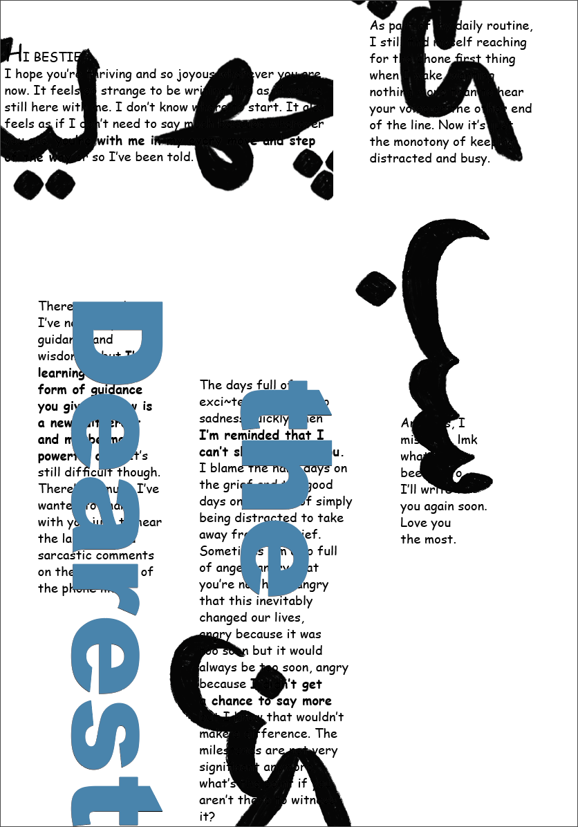
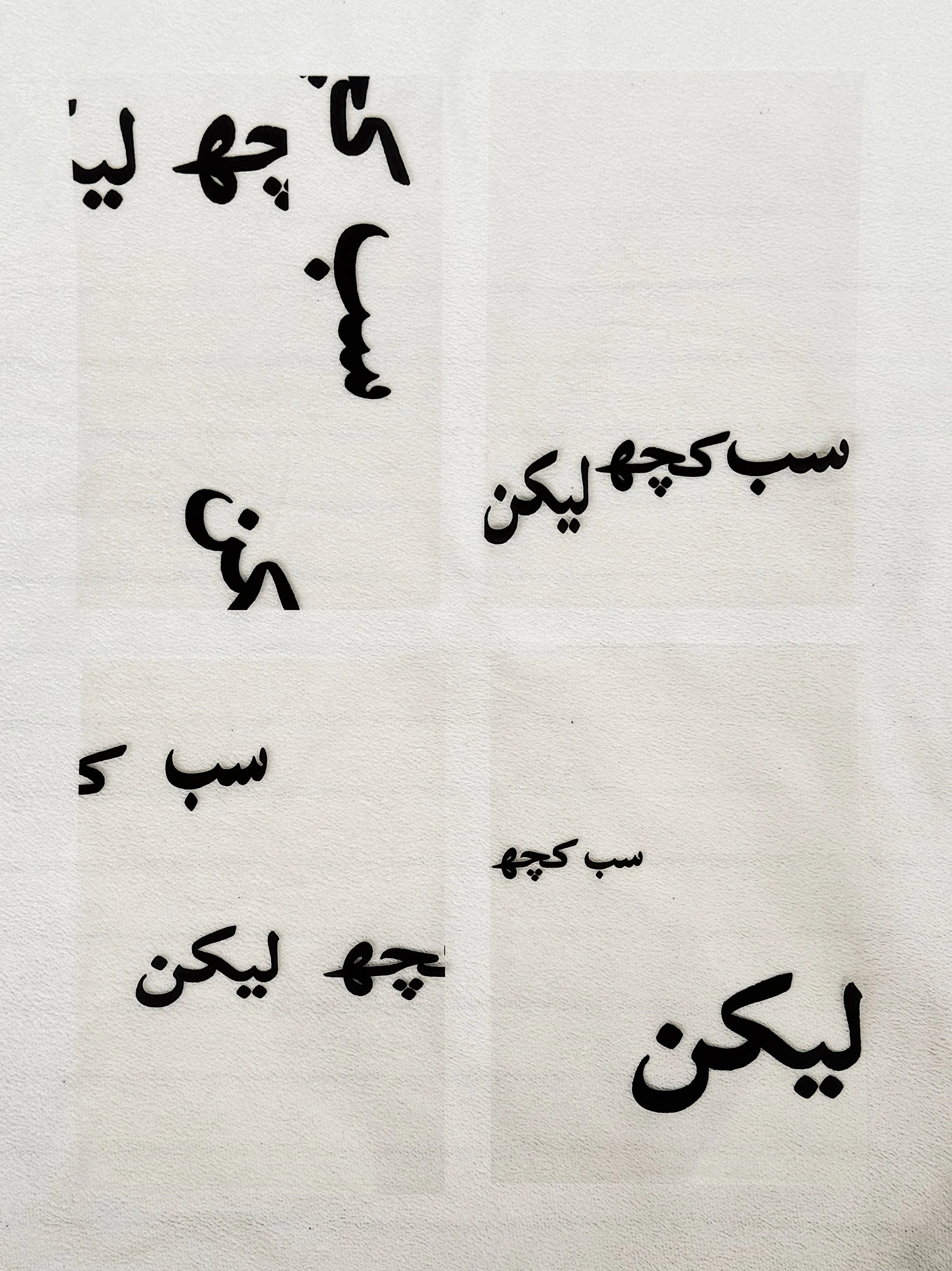
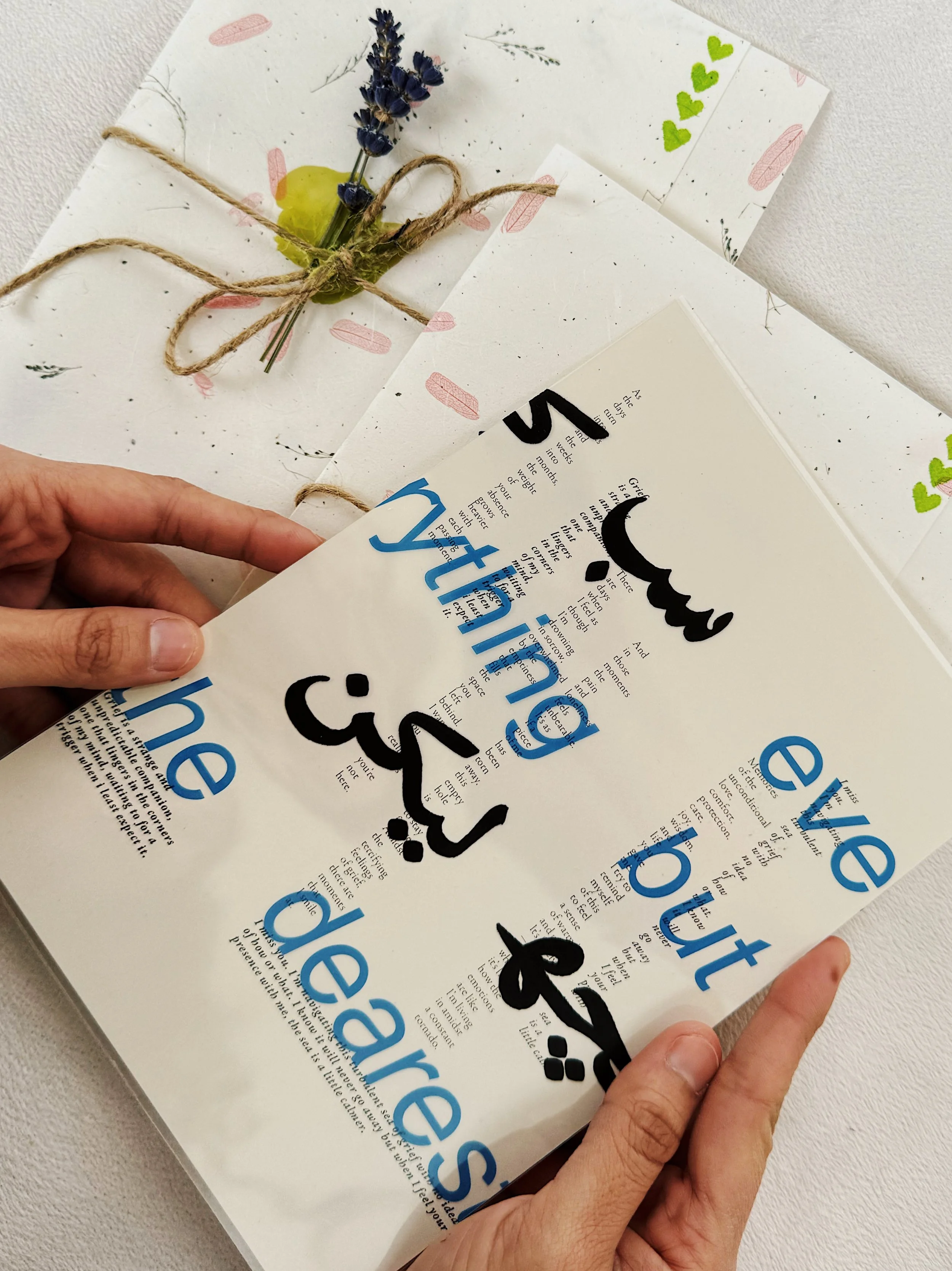
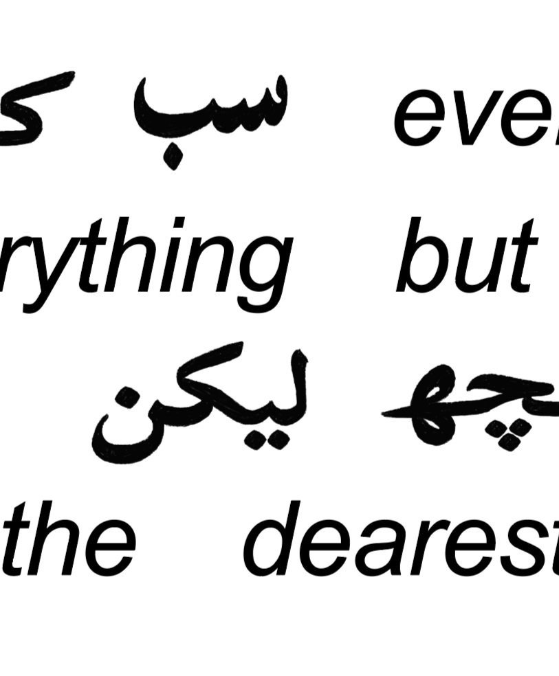
I envisioned each of the four letters being three layers; the English part of the title, the Urdu part of the title, and the body text of the letter. I hand wrote Urdu text “Sabh kuch lakn” translating to “Everything but”, experimented with color and various layouts for the title pages.


Shortlisted a few title pages I thought were more dynamic and explored various type structures




Ideation
After receiving some feedback one the lack of legibility, flow and structure, I finalized 4 layouts that best aligned with the tactile feeling that conveys the complexity of grief.
To incorporate color and create more depth in type, the second layer —English title pages— was made blue.
Packaging
To reflect the deep connection to my father’s memory, the packaging needed to be personalized too. I wanted the audience to experience the nostalgia, intimacy, and comfort around grief so my approach was to create an engaging design.
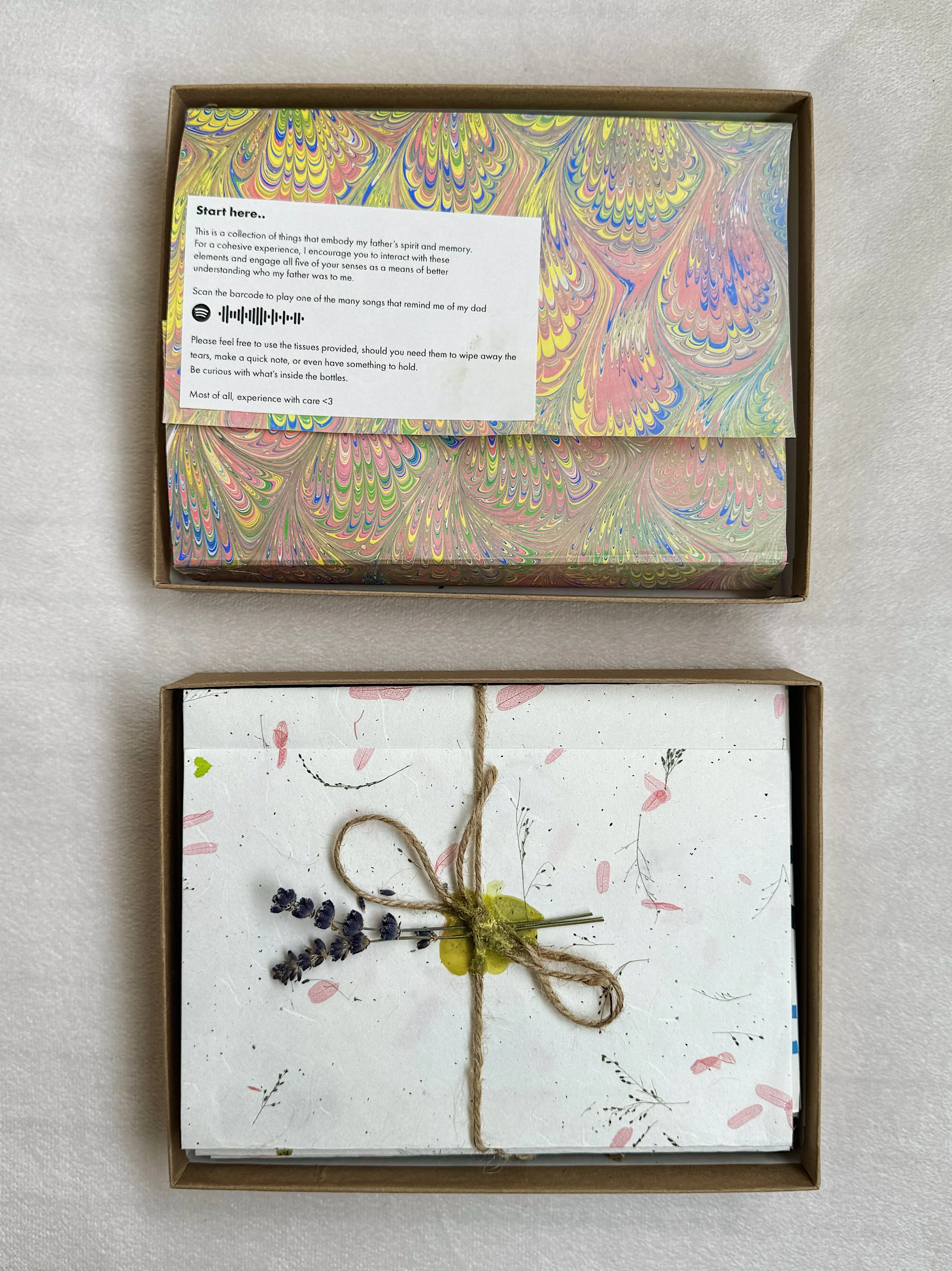
The entire project was contained in a gift box and there were two components to the experience; the lid of the box and the letters themselves.
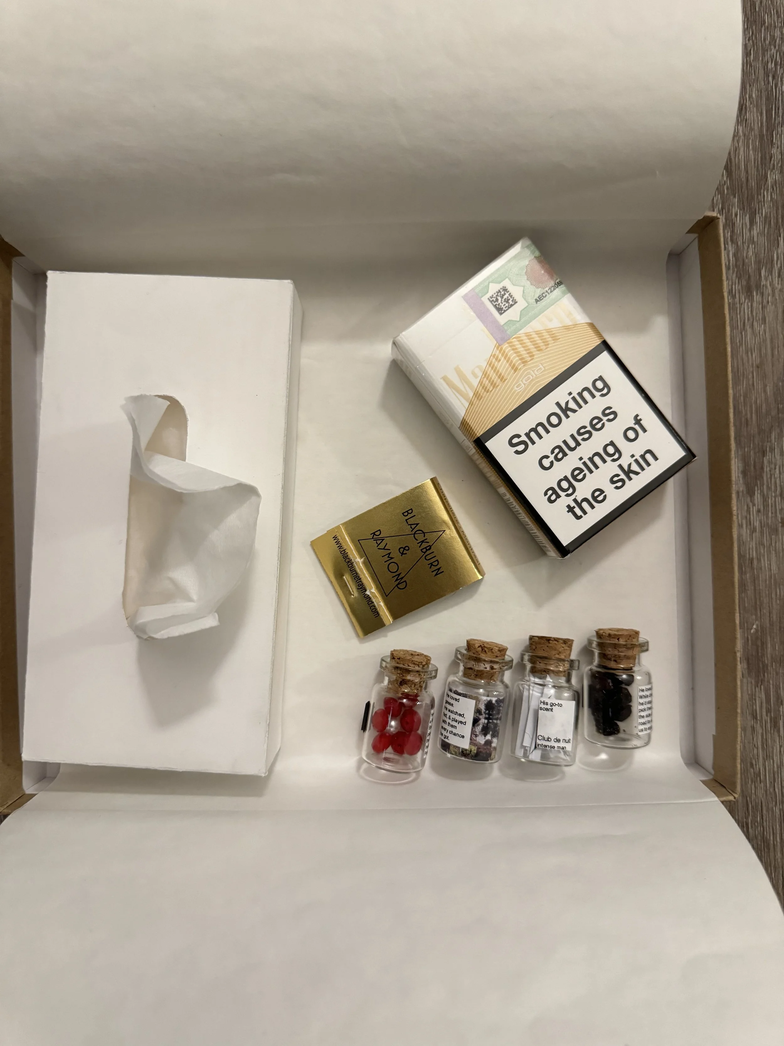
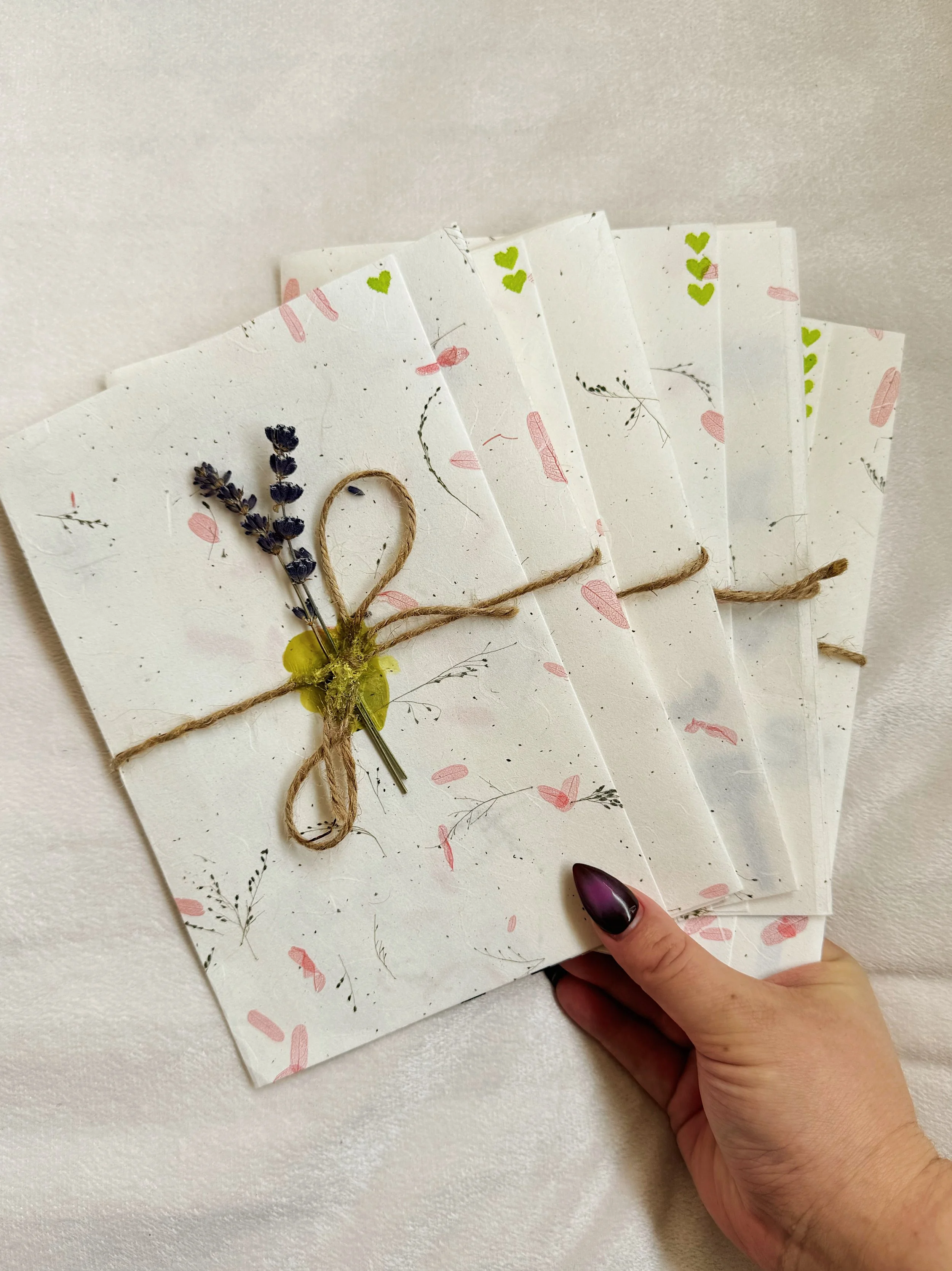
To convey the intimacy around grief, each letter was delicately and individually wrapped in hand-made paper which was then loosely tied with a string and sealed with candle wax and lavender. The lid of the box was a cohesive experience that contained a collection of things to embody my father’s spirit and memory. I used magnets and double sided tape to keep everything in place while also having the contents be interactive.
Gift Box Style
Contents of the Lid:
DIY tissue box
Marlboro Gold cigarettes
Match sticks and a striker
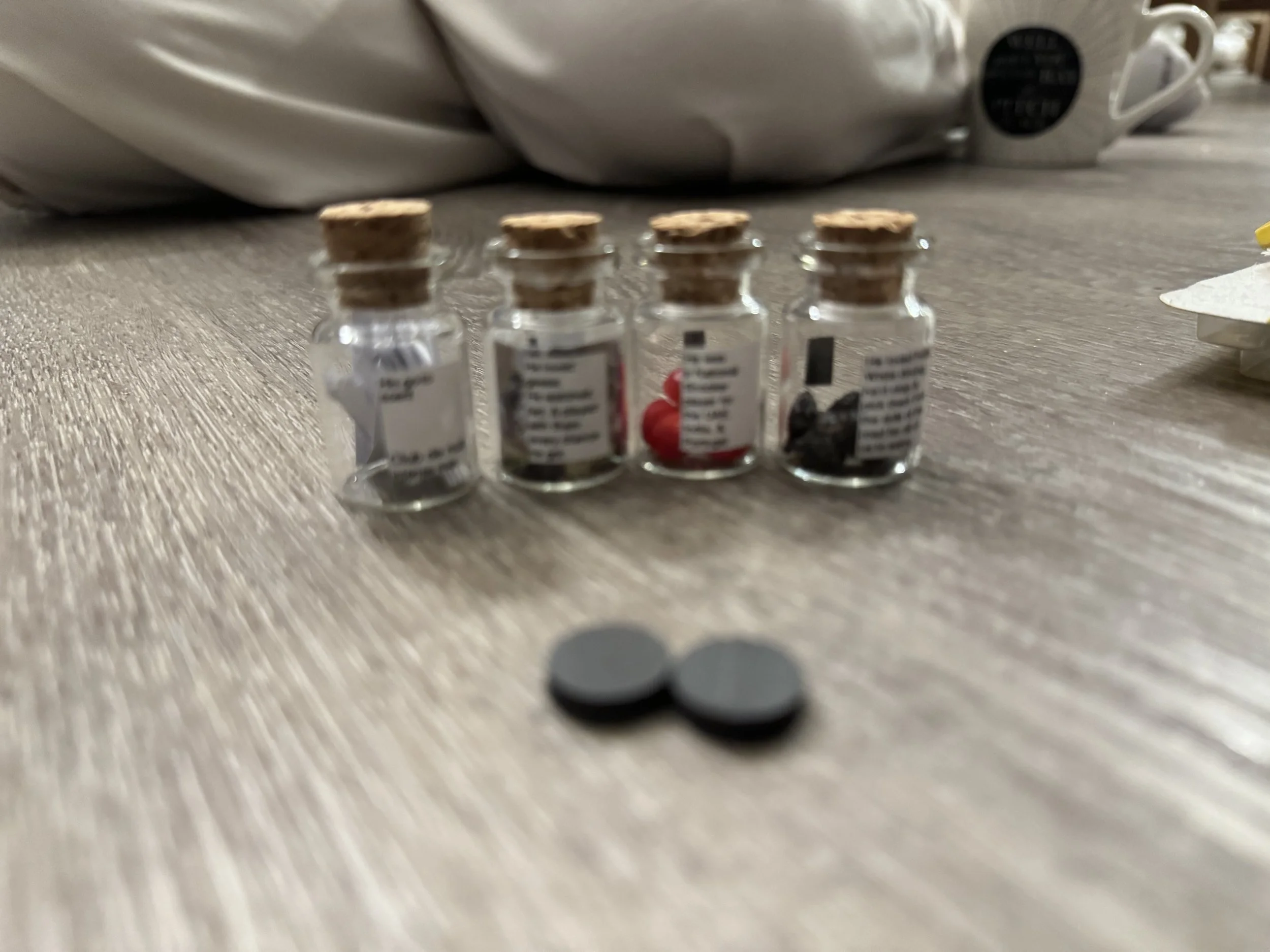
Four bottles representing different memorabilia
Construction of the box and interior elements of the lid
Final Outcome

